
Computers are notorious for spewing out rows and columns of meaningless numbers. Sure, they have significance, but often your audience is more energized when they view something other than a dull table filled with values.
As an example, consider one of the basic pillars of office productivity software: the spreadsheet.
The first spreadsheet, which would still be able to do the job today, was VisiCalc. It was a text-mode spreadsheet, an inspired piece of software, and today relatively unknown outside of hard core techies.
VisiCalc was unseated by a program called Lotus 1-2-3. The big difference between the two was that Lotus 1-2-3 offered graphics. Yes, you could whip up a bar chart or a pie chart and add that to your spreadsheet. Business people went nuts, the software sold like hell, and suddenly it became important for computer software to have another way to display values.
As an aside, one of the first best-selling computer books was Using 1-2-3. The book sold so well, that the publisher cleverly re-branded the title, thereby screwing the original author out of millions of dollars of royalties.
All that history aside, your job for this month’s Exercise is to display a series of values in a bar chart. In this case, the values are average high month temperatures for each month of the year in my own home town. Here are those values:
January  : 35
February : 41
March    : 49
April    : 58
May      : 67
June     : 74
July     : 83
August   : 84
September: 74
October  : 60
November : 43
December : 36
Your job is to create two types of bar charts. The first (and easiest) one is a horizontal bar chart, a sample of which is shown in Figure 1.
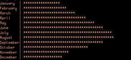
Figure 1. A horizontal bar chart.
The second (and more difficult) one is a vertical bar chart, shown in Figure 2.
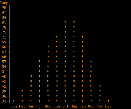
Figure 2. A vertical bar chart (much more difficult to do).
As I remind you each month, please attempt these exercises on your own before you peek at my suggested solutions below. Also, keep in mind that my solutions present merely one way to solve the puzzle. You don’t even have to present the output as shown in Figures 1 and 2 if you can devise something that you find more pleasing.